Crafting a Refreshed Brand for Binks Commercial Insurance
Over the same period of time, we (like hundreds of their other clients) have benefited considerably from their sage and expert guidance in the complex area of commercial insurance.
Who was whose client first is something we have quite frankly lost track of over the years.
Having developed earlier versions of the Binks Insurance brand when we were much, much younger, McGill Buckley was thrilled when Harry Binks approached us for a brand refresh. He was looking for our advice on updating their brand as they headed towards celebrating 100 years in business. Given the changes in their industry and the evolution of the company, we began by looking at the existing messages behind the Binks Insurance brand.
Starting with a questionnaire, interviews and meetings we began to explore how the Binks brand and their industry had evolved over the last few years. Working directly with Harry and Binks senior management we then developed and wrote a new brand messaging platform including:
- a brand positioning statement,
- a series of key messages and
- a new corporate tagline.
Designing a new Binks Logo
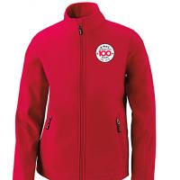
At the same time as we were developing the new brand messaging platform McGill Buckley also developed preliminary concepts for a new brand logo. Our goal was to ensure a consistent tone between the brand messages and brand identity. After submitting a select few logo design concepts for initial consideration and comment, the choices were quickly winnowed down to an obvious favourite.
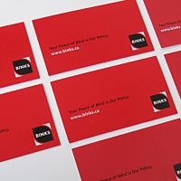
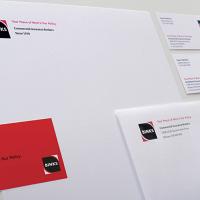
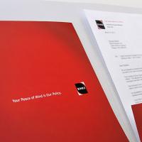
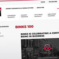
Some minor tweaks to the symbols and colour palettes later, we had the approved logo ready to go. McGill Buckley then developed the brand visual standards and applied the new logo and tagline to a number of key items including the stationery package, collateral materials and a little later a new Binks Insurance website.


